
All websites should be mobile friendly in todays world. Over 50% of your website visitors will now be visiting via a mobile phone or tablet so if your website is not displaying correctly, you are losing business!
How can you tell if your website isn’t mobile friendly?
When you visit a web page from a mobile device it should look different. Everything should be adjusted so that it is clear and easy to read on the mobile device. The big giveaway is if you need to zoom in on a page to read it.
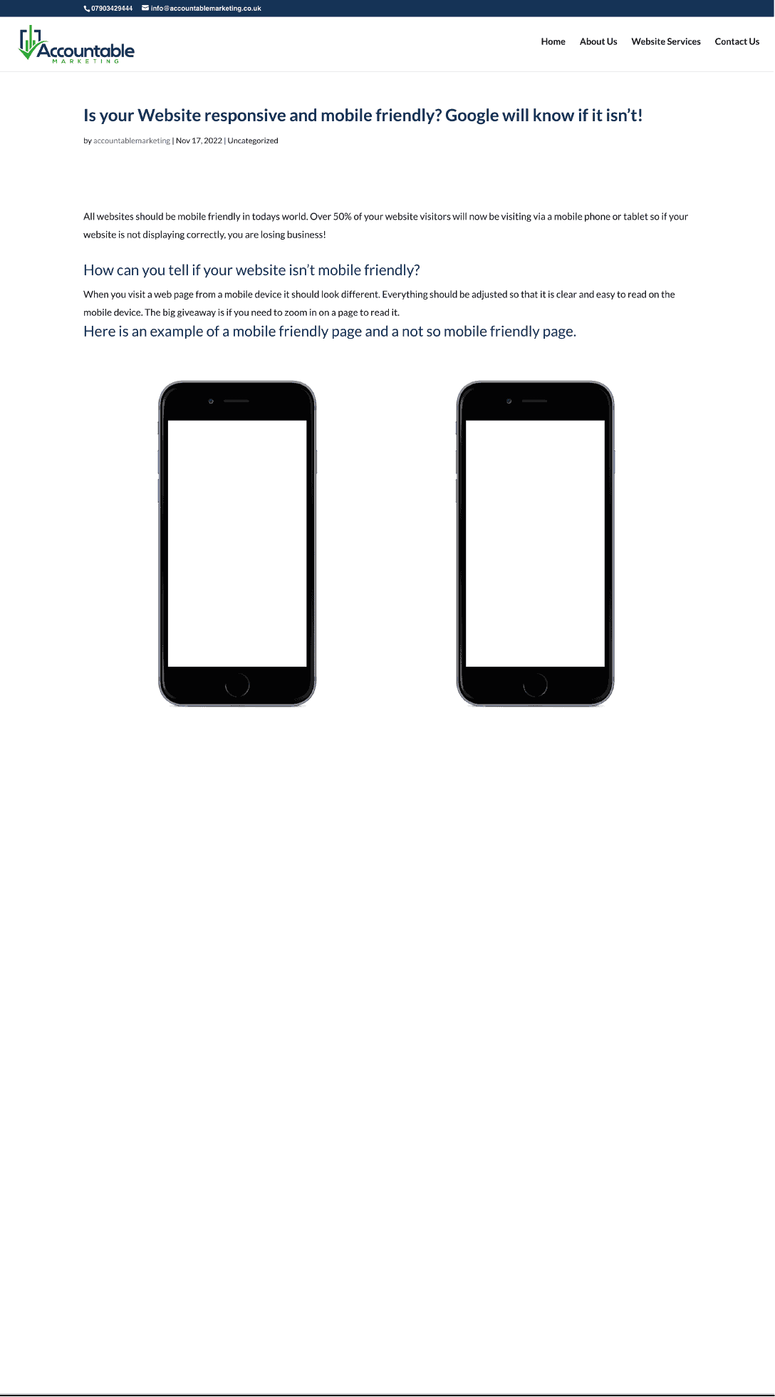
Here is an example of a mobile friendly page and a not so mobile friendly page.
Mobile Friendly Website
This website is an example of a mobile friendly website. As you can see the text is the correct size to be read on a mobile device and the menu has change to a ‘ hamburger menu’ so that the website can still be navigated easily.
Text and images that are positioned side by side whilst viewing a website on a desktop computer or laptop will often change to show one below the other. This allows them to not appear squashed together on a smaller screen.
Why is this important?
Not only does it make it hard for users to use your website if it is not mobile friendly, but also Google reviews your website on how responsive it is. If you are not ticking this box with your website, you will be knocked down the search results. This will become more and more important as the number of websites viewed from a mobile device increase.

Non Mobile Friendly Website
This website is an example of a non mobile friendly website. As you can see the website displays exactly as it would on a desktop or laptop screen. As the mobile device screens are a lot small this can make using them very difficult and in some cases nearly impossible.
The menu bar at the top of the page is still showing however the writing will appear extremely small mean people will have to zoom in a drag the screen around to read anything.
The rest of the content will also display much too small for visitors and in the majority of cases they will leave.
To fix this issue you need to have a responsive, mobile friendly website that adapts to whatever screen size you visitor is using.
Do you need your website making mobile friendly or a new website creating?
If you would like some assistance in making your current website mobile friendly, or you need a new website and want to ensure is is up to date with the latest in website design. Get in touch today for a chat about how we can help you.